Case Study
Proprietary
Creating a dashboard for advertisers to stay up-to-date on emerging trends
Info
Role: Product Designer
Platform: Web app

At YouTube Ads, I was tasked with creating a dashboard for advertisers to stay up to date on emerging trends. This case study focuses on the UX methodology, cross-functional collaboration, and systems-thinking required to align a highly complex product.

YouTube is a massive platform, hosting over 14 billion videos across 115 million channels. For content creators, this is an incredible ecosystem. But for businesses and advertising agencies, it can be overwhelming. Brands are constantly trying to make sense of this content to find marketing potential. Whether it is an ice cream shop trying to capitalize on the viral "Dubai chocolate" trend, or a shoe company looking to capture a new audience by collaborating with a trending "toy blind box" brand, advertisers are looking for opportunities to stay relevant.

Falling Behind the Curve: The primary issue brands face is timing. Advertisers often discover a trend three months after it has already gone viral. With an overwhelming amount of content to watch, they struggle to keep up, let alone stay ahead of the curve.
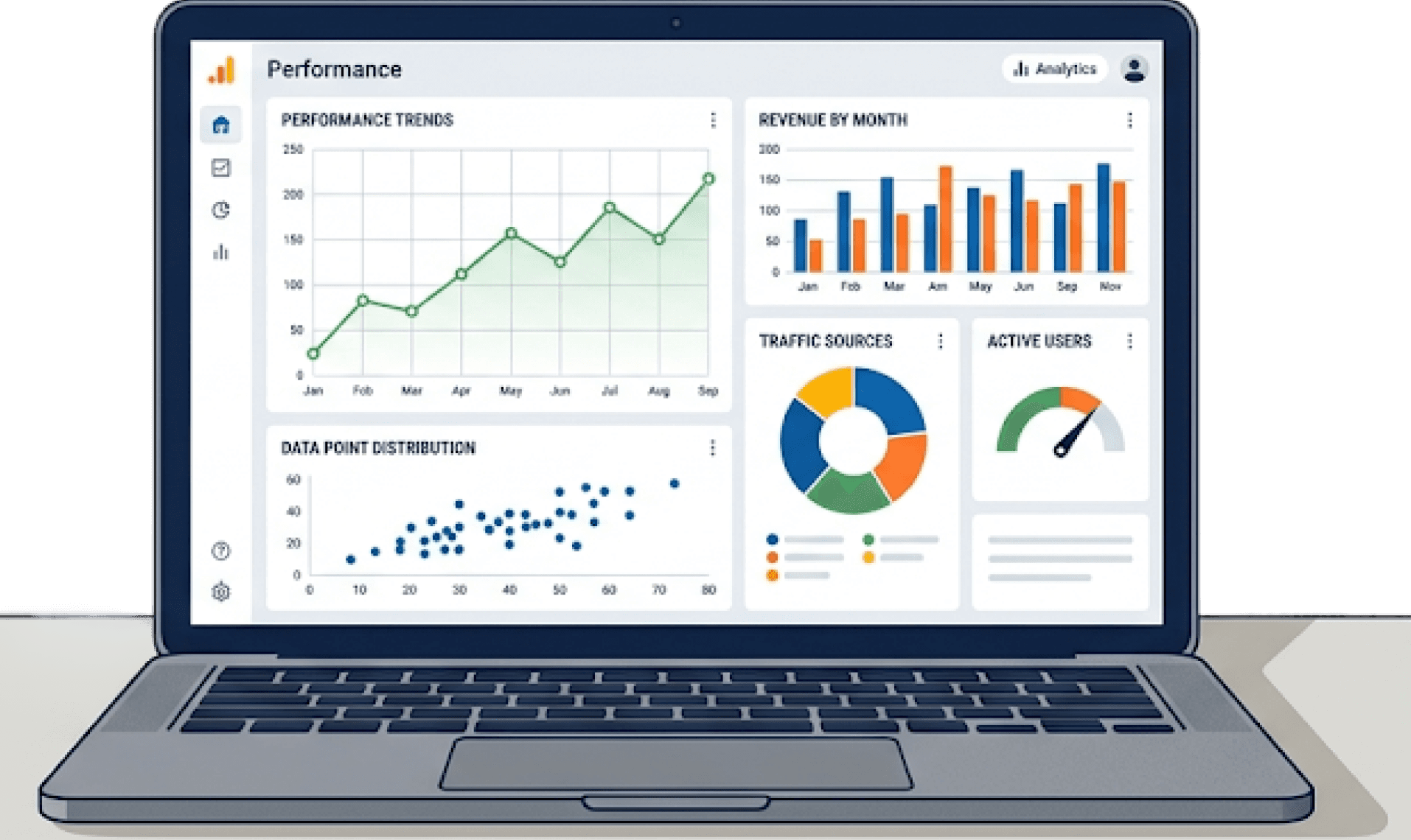
Build a dashboard for advertisers so they can monitor trends to make informed decisions for their business.
Google and YouTube introduced a new feature called Insights Finder. We set out to build a tool that doesn't just show what is currently trending, but provides predictions based on platform data.
This feature allows marketers to look at data across four key pillars:
Audience: Understanding personas and search behaviors.
Trends: Discovering industry shifts.
Content: Exploring deep insights into what people are watching.
Action: Creating actionable marketing strategies.

Discover & Learn

When I joined the team, I was starting from the ground up. I relied on my team’s knowledge to get me up to speed on our project, but I had to strategize what questions would be the most appropriate to ask. Here’s what I uncovered:
UX Researcher: I asked for user interview transcripts to identify major pain points and understand what advertisers cared about the most.
Engineers: I asked about established design systems or previously shipped projects that had opportunity to reuse components. I also worked with them to understand exactly how metrics were calculated and what data we were technically allowed to fetch.
Product Management (PM): I clarified legal limitations—such as ensuring a shoe company couldn't access a competitor's private audience data—and identified our primary target audience so we could prioritize feature building. I also familiarized myself with established marketing jargon to deeply understand the industry.
Team Collaboration

With a good number of ideas and opinions coming from the team, the challenge was deciding which path to take.
Instead of moving fast and clinging to one initial concept, I laid out all the possibilities at the forefront. By testing out different ideas early, we discovered that there was rarely one clear winner. Instead, we took fragments of each idea, combined them, and created stronger, refined iterations. By exploring designs early, we built incredibly strong team alignment.
Documentation
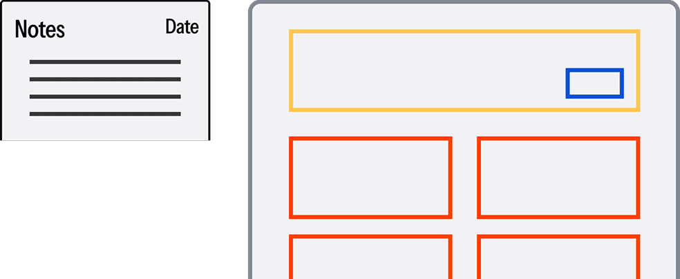
In fast-paced environments, there always comes a time when a team member asks, "Wait, why didn't we go with that previous design? I thought that was what advertisers wanted."
Faced with the tradeoff of moving extremely fast with zero documentation versus moving steadily with thorough documentation, I chose the steady path. Moving too fast without notes leads to uncertainty and forces the team to talk in circles.
I maintained strict documentation on every iteration, noting exactly why a design was abandoned—whether it was not in the PRD scope, not technically feasible for engineering to fetch, legally restricted, or unsuitable based on design heuristics. Being a "historian" ultimately saved us a massive amount of time in the long run.
The greatest impact of this design process isn't something you can see on a screen. It is the invisible alignment—eliminating the guesswork, documenting the "why," and giving the team absolute confidence in the direction we were heading.
By proactively navigating legal constraints, championing component reuse, and rigorously tracking our UX decisions, I was able to take a highly ambiguous, data-heavy product requirement and deliver a fully aligned, engineering-ready dashboard framework.